
Top 5 Product Page Mistakes That Quietly Kill Shopify Conversion Rate
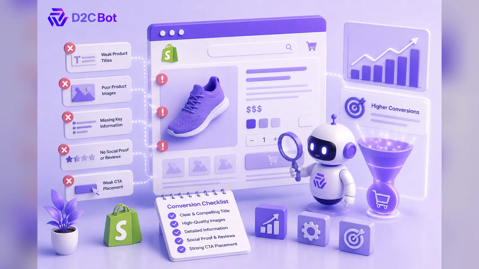

Your ads may not be the problem.
Ecommerce brands frequently spend thousands of dollars diagnosing ad creative, adjusting demographic targeting, and bidding higher on paid social platforms when customer acquisition costs spike. Yet, a surprisingly high percentage of abandoned visits stem entirely from friction on the product detail page. When shoppers click through your advertisements, your product page bears the heavy burden of turning initial curiosity into a completed transaction.
Small, subtle design flaws and copy mistakes on your product detail page silently erode buyer confidence, causing interested visitors to bounce. Before pouring additional capital into digital ad campaigns, brands must address structural conversion bottlenecks. Optimizing the on-page experience transforms existing traffic into predictable revenue without expanding ad spend.
Why Product Pages Have a Bigger Impact Than Most Brands Realize
A product detail page serves as the ultimate decision-making hub for prospective buyers. It functions as your digital storefront salesperson, responsible for establishing trust within seconds of a user arriving from paid channels.
When visitors land on an unoptimized product detail page, hesitation sets in rapidly. Poorly structured information creates cognitive friction, forcing shoppers to search for critical details like shipping costs, sizing, or benefits. This delay directly reduces conversion momentum and damages return on ad spend.
By refining your product detail page, you build immediate buyer confidence, lower customer acquisition costs, and maximize paid traffic efficiency across every marketing funnel.
Mistake 1 — Weak Above-the-Fold Messaging
The space visible on screen before a user scrolls represents your most valuable digital real estate. Failing to communicate an unambiguous value proposition immediately above the fold causes bouncing visitors. Many Shopify store designs feature oversized hero images, generic product titles, or creative typography that buries the core utility of the product.
A high-converting primary screen must instantly answer three questions: what the product is, who it is for, and why it is superior to alternatives. Obscuring the Add-to-Cart button or pushing key benefits down the page forces users to work to understand your offer.
Replace artistic, vague headlines with benefit-driven descriptors. Ensure your primary call-to-action button is visually dominant, using high-contrast colors that stand out against background elements. Include short, punchy bullet points directly adjacent to the main product media gallery highlighting key capabilities, materials, or immediate outcomes.
Mistake 2 — Social Proof Appears Too Late
Placing customer reviews and star ratings exclusively near the bottom footer of a long product detail page is a costly layout error. Prospective customers look for reassurance almost immediately upon landing. If social proof is hidden beneath long paragraphs of text, shoppers often leave before ever encountering it.
Integrate trust signals higher in your page hierarchy. Position average star ratings and total review counts directly beneath the main product title so buyers see validation instantly.
For high-ticket or complex items, snippet reviews or brief customer quotes placed right beside the main Add-to-Cart area reduce last-minute purchase anxiety. Highlighting media mentions, trust badges, or authentic customer user-generated content near primary action zones reassures shoppers, validates your pricing structure, and dramatically accelerates purchasing decisions.
Mistake 3 — Confusing Product Variants
Variant selection interfaces are frequent sources of hidden user drop-off on Shopify storefronts. When customers struggle to select sizes, colors, bundles, or recurring delivery options, they quickly lose patience and abandon their carts entirely.
Common design flaws include non-descriptive variant names, unhelpful drop-down menus, and poor visual indicators for out-of-stock items. If selecting a different color fails to update the main product image instantly, buyers become uncertain about what they are ordering.
Use clear swatch selectors instead of generic drop-down menus whenever possible. Clearly gray out or mark unavailable options while providing simple back-in-stock notification triggers. Include dynamic, clear sizing guides directly near size variant buttons to remove guesswork and prevent avoidable post-purchase return loops.
Mistake 4 — Weak Offer Framing
Displaying an isolated price point without context creates severe price sensitivity. High-converting Shopify stores frame their product offers to emphasize immediate value, convenience, and risk reduction rather than simply listing a baseline numeric cost.
Failing to clearly communicate savings, threshold shipping incentives, or multi-pack savings leaves money on the table. Unclear return policies or hidden shipping costs disclosed late in the checkout journey trigger instant cart abandonment.
Present your pricing alongside active incentive structures. Highlight dynamic free-shipping progress indicators directly near the main buy button, showcase bundle savings clearly, and feature bold money-back guarantees near your primary call-to-action to minimize customer hesitation.
Mistake 5 — Poor Mobile Shopping Experience
Because mobile devices account for the majority of ecommerce traffic, desktop-first design thinking remains a fatal mistake. Cluttered interfaces, tiny tap targets, slow image loading speeds, and non-sticky action buttons ruin mobile user experiences.
When mobile shoppers are forced to scroll extensively to locate pricing or purchasing options, conversion rates drop dramatically. Text that appears readable on desktop displays frequently turns into dense, unreadable paragraphs on mobile screens.
Implement a persistent sticky Add-to-Cart bar that remains visible as mobile users scroll through long product pages. Optimize media files to ensure lightning-fast image rendering, enlarge tap targets for effortless thumbs-only navigation, and streamline checkout fields to eliminate purchase friction entirely.
Evaluating Product Page Performance
Comparing how structured improvements directly address common baseline errors helps identify clear optimization priorities for your storefront:
| High-Converting Product Page | Low-Converting Product Page |
| Clear value proposition visible above fold | Vague product titles and missing benefits |
| Star ratings and reviews near primary title | Social proof buried deep near page footer |
| Visual swatches with explicit stock status | Confusing variant menus and missing size charts |
| Explicit free shipping and guarantee callouts | Isolated prices with undisclosed shipping costs |
| Responsive layout with sticky purchase buttons | Non-optimized mobile view requiring heavy scrolling |
| High buyer confidence and clear next steps | Elevated friction leading to immediate bounce |
Product Page Audit Checklist
Review this checklist before scaling ad spend to ensure your product pages convert efficiently:
- Primary value proposition and benefit bullets clearly visible above the fold.
- Star ratings and review totals positioned near the main product title.
- High-contrast Add-to-Cart button visible instantly on desktop and mobile screens.
- Interactive visual swatches configured for seamless color and size selection.
- Dynamic sizing chart accessible directly within the primary buying pane.
- Explicit shipping thresholds and return guarantees placed near purchase controls.
- Media files fully compressed to maintain rapid mobile page loading speeds.
- Persistent sticky purchase button active across all mobile viewports.
Conclusion
Improving your product detail pages consistently yields a higher, more sustainable return on investment than simply increasing ad budgets. When you eliminate layout friction, elevate social proof, clarify product variants, and refine your mobile shopping interface, you unlock hidden revenue within your existing web traffic. Optimizing the overall user experience removes buying hesitation, builds authentic brand trust, and creates an efficient foundation for scaling your marketing operations.
Audit your product pages to identify hidden conversion barriers, improve customer confidence, and get more value from every visitor your marketing brings in.
More Articles
- https://d2cbot.com/blog/ai-in-seo/turn-feedback-into-sales-the-ultimate-guide-to-ai-product-review-generators/
- https://d2cbot.com/blog/ai-in-seo/ai-ecommerce-content-generator-14-languages-2/
- https://d2cbot.com/blog/shopify-seo/best-seo-description-writer-large-catalogs/
- https://d2cbot.com/blog/ecommerce/how-to-create-an-amazon-storefront/
FAQs
Clear above-the-fold value messaging, high-contrast call-to-action buttons, prominent social proof, simple variant selection, and seamless mobile responsiveness drive the largest conversion rate improvements across Shopify stores.
Ads merely generate curiosity and drive initial web traffic, whereas product pages perform the actual sales pitch, addressing customer objections, establishing trust, and converting visitors into paying customers.
Audit and optimize product pages quarterly, or whenever customer acquisition costs rise, traffic patterns shift, new product lines launch, or major user experience friction points are identified.
Above-the-fold content includes all visual and textual elements visible on screen immediately when a page loads, prior to the user scrolling down the screen.
Mobile optimization reduces user friction by speeding up load times, simplifying navigation, utilizing sticky buy buttons, and making purchase buttons easy to tap on smaller screens.